Tuesday, July 17, 2012

A Little Lesson in Vanity

Well, I couldn't be more excited to be featured on Just a A Girl's blog as a Feature Friday project!
Once again she has inspired me- this time to blow the dust off my keyboard and resurrect my oh-so-outdated blog. This moving process has be a yearlong process, but now we are finally settled in. WooHoo! 
Once all of the projects around the house are complete I promise to find time to start scrapbooking again. My room is organized and only requires a few minor touches. :0) I have a retreat coming up in August so I'm so glad I'll be "forced" to pull out the tape gun and dig through my tubs of patterned paper and get creative. Until then, I thought I would highlight a few of our little around-the-house DIY projects!

My favorite so far is my bathrooom vanity.

When we chose our floor plan we knew we would have to do a few tweaks. One of those being the master bathroom space. For some reason the designer thought it would be a good idea to put an awkward linen closet sticking right out of the middle of the wall. Since the closet had ample shelving we eliminated the linen closet which left a 9 foot wall just begging for a piece of fabulous furniture. I knew I needed a vanity for all of my makeup and girlie products so the hunt began. Luckily my husband is an architect with some pretty awesome clients and one of them spotted this fabulous vanity in a vintage clothing store in The Heights, Houston. We ran down there and snatched up the 9 ft. long, yellow monstrosity as we could. 
Thanks to Chris and her fabulous painting tutorial I had a plan! I got a great deal at Benjamin Moore on the paint when I sweet talked him into giving me contractor pricing. I found the water-based primer version of the oil-based one she mentions which isn't quite as good. If I could do it over again, I would do a light sanding before priming or hunt down her oil-based primer.  Maybe I wouldn't need as many coats of paint- 6 to be exact! I think it turned out pretty nice and made the painting well worth it in the end though! 
After screwing on the Hobby Lobby "$2 dollar each" knobs, the vanity was complete! We painted the walls with Benjamin Moore Harbor Haze paint. I finally got to hang the awesome mirror from ZGallerie my hubby got me for Christmas. The lamps and chair were a super exciting find at our Marshall's Homegoods and the chandelier hanging above the tub is a great Overstock knockoff of the Pottery Barn version for a fraction of the price. I do love my bargains! 
I'll pick out a few more projects to share soon! As for now, I leave you with my boys "Seal of Approval". 


Monday, February 6, 2012

Taking a Break

So, I haven't stopped scrapbooking, but we are building a house and all of my stuff is packed up. . .so I'm taking a break. I'll be back in May 2012! I have a 16x14 scrapbooking room to look forward to that is being sheetrocked as I type. Can't wait!

Here is where the house is 3 months from completion:


Tuesday, March 15, 2011

Adopting Truman & a Mardi Pardi!

The last time I was at my LSS I had to get a few sheets each from My Mind's Eye's new lines. This was my first attempt with them and I just love them! I also tried some paint which isn't my thing, but I'm sure I'll get better with it. :0)

The sketch came from Get Picky. This blog has the most elegant layouts and inspirational examples and I'm so glad they did a double pager this go around!


Chipboard, pearls, brads, ink, and of course. . . Glossy Accents!

I used my heart punch to make some super quick simple flowers.

I just LOVE this paper!


I was dreading scrapping the Mardi Gras Party the boys had at Daycare because how do you not make Mardi Gras colors obnoxious. . .I did my best, but WOW! they are bright!

This is another double page sketch from Sketchy Thursdays. They always have my favorite sketches and when I saw it was a double this week- I was sending the LOVE!

I made my own beads with rhinestones and my new white Souffle pen on this layout. . .I love those pens!

I has real beads on here, but it was way too much so I popped them off and covered the glue with the purple and white ribbon. . .much better!


I doodled away with my new pens in white and black on this page! With such a mix of papers I think it turned out pretty cohesive. :0)
Posted by Picasa

Super Cuteness Warning!

Okay, so I know everyone says it, but I soooo do have the cutest puppies ever! Yes, I count my sister's little white Maltese in the mix since he comes next door to play often. I had one day to scrap before Aspen and since Kristy was working (and couldn't finish the ski trip with me) I had no choice but to scrap the pups! So... WARNING... get ready for some serious CUTENESS!

This first sketch came from the Scrapbooking Competitions blog. I loved this layout when I saw it and really wanted to use some black and white photos with the adorable bold Little Boy line by Echo Park.
Truman and Quincy are really doing well in puppy training class.
Their graduation is in two weeks. :0)

I am seriously going to have to seek help for my addiction to Glossy Accents! This stuff belongs on EVERYTHING!


I love having Granny's Collection of Buttons to use-
I'm so impressed she saved so many unique ones!

This next double pager came from two one pager competitions. The left side is an amazing Sketchabilities sketch. I really love how the sketch could be interpreted so many ways. I missed the entry date, but still so love that sketch! The right page came from a Stuck? sketch that I turned the line of photos vertically instead of horizontally. I really love how they work together.

I enjoyed playing with the Adorn It papers while creating this layout. I was fussy cutting up a storm- I guess I was thinking about Audrey's scrapbooking class I took today. She is the Fussy Cutting Queen!

I hand journaled on this page which I NEVER do- I just hate my handwriting, but I had to use my cool new Souffle pens. :0)
Posted by Picasa

Friday, March 11, 2011

Retreat Layouts- Four Now...

Well, this is it for the retreat but not the trip. I still have 4 double page layouts to go, but with Aspen in less than a week those will have to wait. Bring on the SPRING snow!

I really love my Silhouette! I mainly use it for titles, but I plan to branch out a bit more. I also love the new fonts I found on the Fonts for Peas website.

This double page layout came from two different competitions. The first page used several different kinds of media. My Creative Scrapbook's March 2011 challenge called for the use of mixed media, which for me included distressing inks, Stickles, Glossy Accents, glitter, embossing, and a Perfect Pearls mist. The second page was a sketch challenge from Pencil Lines Sketch 228. They always have the best ideas!


(Click to enlarge)

Stickles and Popdots. . .Staples of Scrappin'

Yes, the inked chipboard was another bingo box marked off. I think I bingoed a total of 7 times!

***************************************************

I loved the picture I took of me in Kristy's goggles. :0)

(Click to enlarge)

Granny's antique buttons really add a lot to our layouts.


That's all for now. . .
Posted by Picasa

Retreat Layout: Third Installment

The hot tub was a major player in our ability to ski- without it we would have been hobbling around like we were 80! On this layout we really wanted to use the adorable snowflake circles from the My Mind's Eye paper. You can see them strung across the pages below.

(Click to enlarge)

We popped a few of the snowflake circles and used the Basic Grey chipboard frames to add a bit of dimension.

I won an awesome set of Souffle pens at the retreat, so I added a little bit of steam above the letters (which I Glossy Accented of course).

*************************************************************

It is unusual for me to use a solid cardstock as the main paper, but I may have to do it more often because the snowflakes I fussy cut stand out so nicely against the solid blue.
(Click to enlarge)

I layered a little bit of tulle on the flower to check off a square on our Scrapbooking bingo game. It was great motivation!

Rhinestones, glitter, tulle finish the layout off.

*************************************************************

This picture of Kristy and me was my favorite of the trip!
(Click to enlarge)


This paper I won from a blog contest was a bit thin (notice the bubbling), but had great color!
Posted by Picasa

Retreat Layouts- Two for the Money!

I really wanted to do a monochromatic layout so here it is! These beautiful snowflakes were on a piece of Kristy's paper that I stole from her. I fussy cut them before she knew what I was doing. :0) I really have the bestest sister/scrappy buddy ever!
(Click to enlarge)

Cutting letters, Dotting stickles. . .

Popping flakes, blinging flakes. . . Viola!

************************************************************

Wow! It was hot in the condo once you were dressed and waiting patiently. My face says it all!

(Click to enlarge)


Note: I finally use the felt cutout border I had to have 20 of at our first Scrapbooking Convention!

Crazy with the 3D snowflakes. . .so pretty!

************************************************************

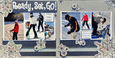
Kristy and I had so much fun just skiing and taking pictures when the boys tackled the blues. Here are a few shots from our leisurely runs. :) This layout was inspired by the 3-9-11 sketch on Let's Scrap. They have THE best collection of 2 page sketches!

(Click to enlarge)

I'm not sure these will fit in a page projector, but I love how they look!

I played with my Martha Stewart punches on these accordion flowers.

************************************************************

I looked up a ton of titles before we left. . .pretty creative huh?

(Click to enlarge)

I loved how the acrylic paint looked like snow on the letters.


Basic Grey's little felt snowmen MELT my heart!
Posted by Picasa